Commudle
Role:
Product Designer
Duration:
6 Months
Team Size:
1
Platform:
Web & Mobile
Project Overview
Commudle is an online community platform for techies & businesses to engage with each other through knowledge & communities.
The platform faced challenges related to user engagement, usability, and conveying its vibrant community spirit through its existing design.
The Challenge
Enhance user engagement, usability, and community connection on Commudle by revamping the home, About, and profile pages to better reflect the platform’s vibrant community spirit.
My Approach
Revamped the home page, about page, and user profile page by adding engaging hero animations, personalized doodles, user-friendly profile badges, and a freelancer toggle switch, crafting an accessible and immersive experience that aligns with Commudle’s mission.
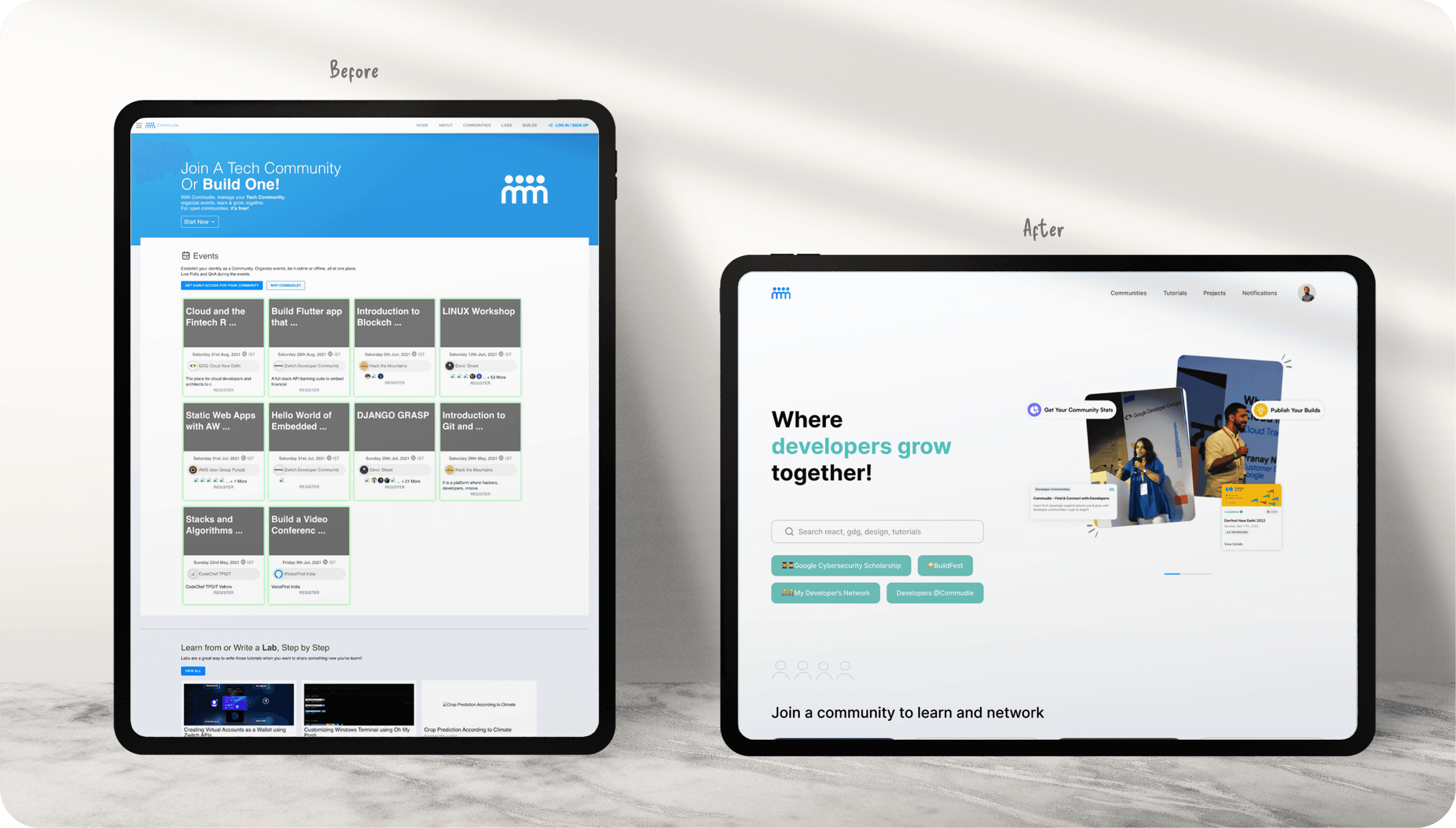
*Mockups showcasing the transformation: Before and After of the homepage design.
The Problem: Explained
The home page lacked an engaging focal point, the About page needed a more immersive representation of the community's diversity, and the user profile page required improvements in accessibility, representation of user accomplishments, and an easier way for freelancers to indicate their availability.
These design shortcomings hindered the platform's ability to effectively connect individuals from diverse backgrounds and interests and create a thriving online community.
Great designs start with great conversations
I engaged in a series of video calls with Commudle's CEO to gain a deep understanding of their specific needs and requirements.
Through these discussions, I had the opportunity to explore and exchange ideas, ensuring that I could tailor my design efforts to precisely meet the company's expectations and objectives.
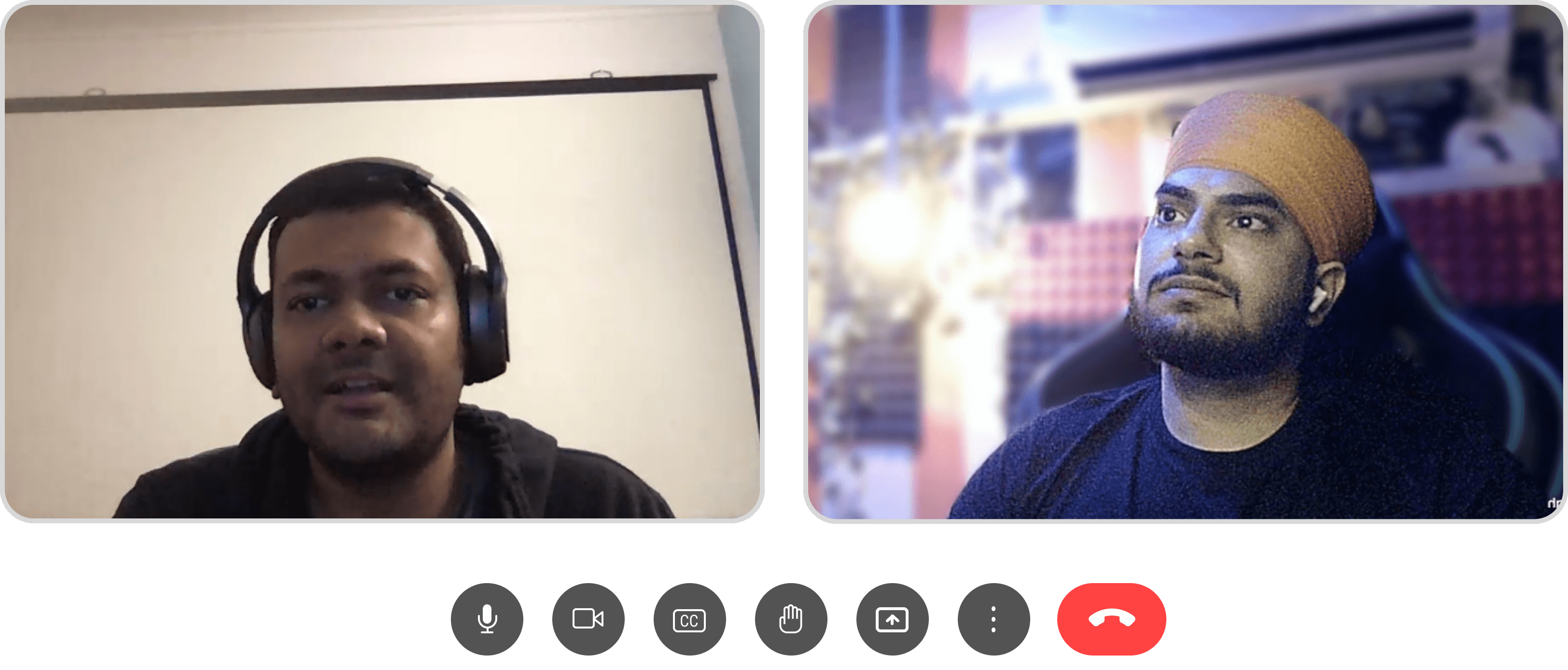
*Arpan (CEO of Commudle) and I discussing the product's vision and strategy
The video calls with him was like embarking on a journey!
There are several key points emerged that should be our focus:
Implementing reusable design components.
Standardizing design guidelines.
Ensuring an easily codable design.
Prioritizing a mobile-first design.
Incorporating fast development elements.
Identifying problems in existing design
I initially pinpointed the fundamental issues within the current design of the Commudle homepage.

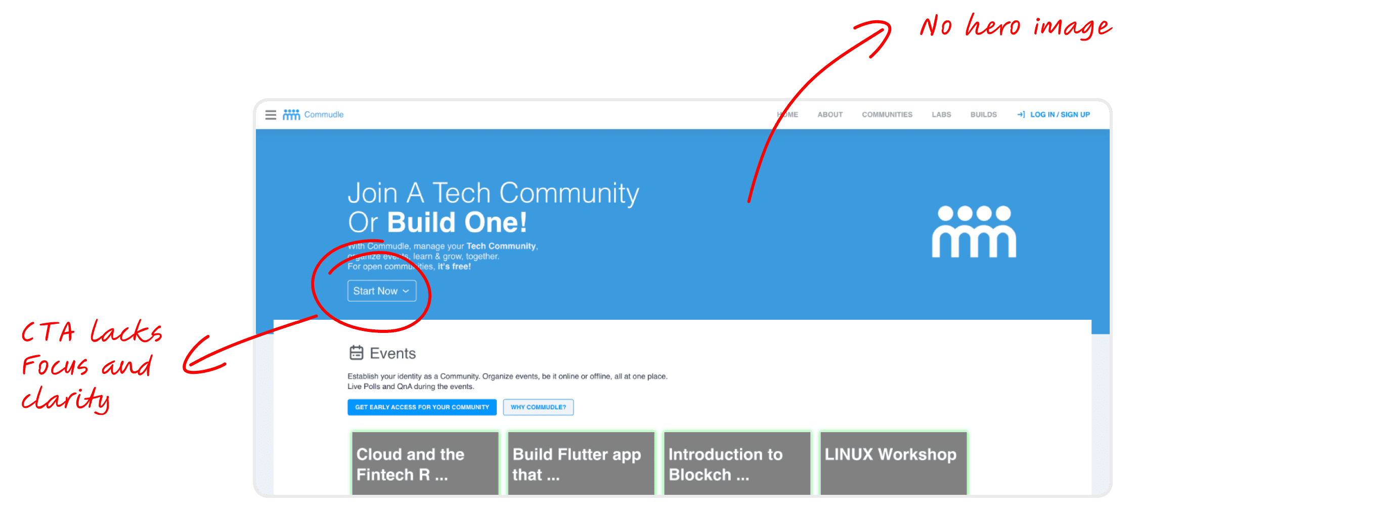
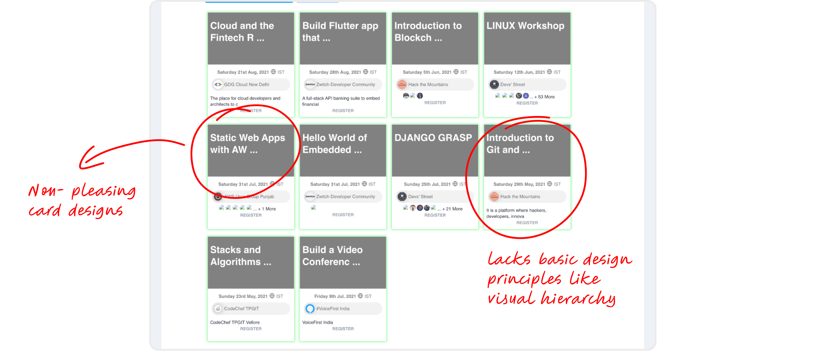
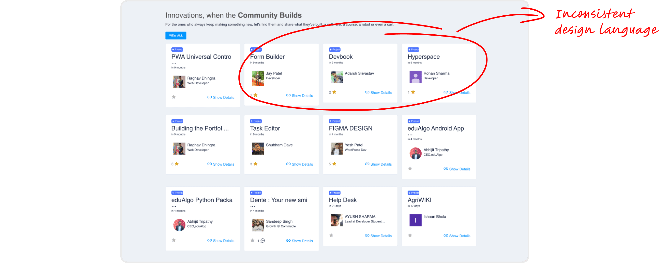
The previous homepage saw limited engagement, with only 80-90k interactions in 12 months. Our goal was to boost engagement by at least 20-30%.
Let's dive into the new homepage and see how it all came together.

*Revamped Homepage: A fresh look with enhanced user experience.
Small changes lead to big impacts
Over the past 12 months, Commudle achieved an impressive milestone, recording 380,000 engagements on its homepage—a testament to the power of thoughtful design and user-focused improvements.
The hero section earned its name by being the first thing users see!
The existing home page lacked an engaging visual element to capture users' attention. To address this, I proposed the inclusion of a Hero Animation, which presented a unique design and development challenge.
*The hero animation featured on the homepage
Developers would have committed suicide if I had handed over this animation in MP4 format
To make development smoother, I used the Bodymovin plugin to export the animation in JSON format from After Effects. This made it easier for developers to implement.
What's more on the home page?
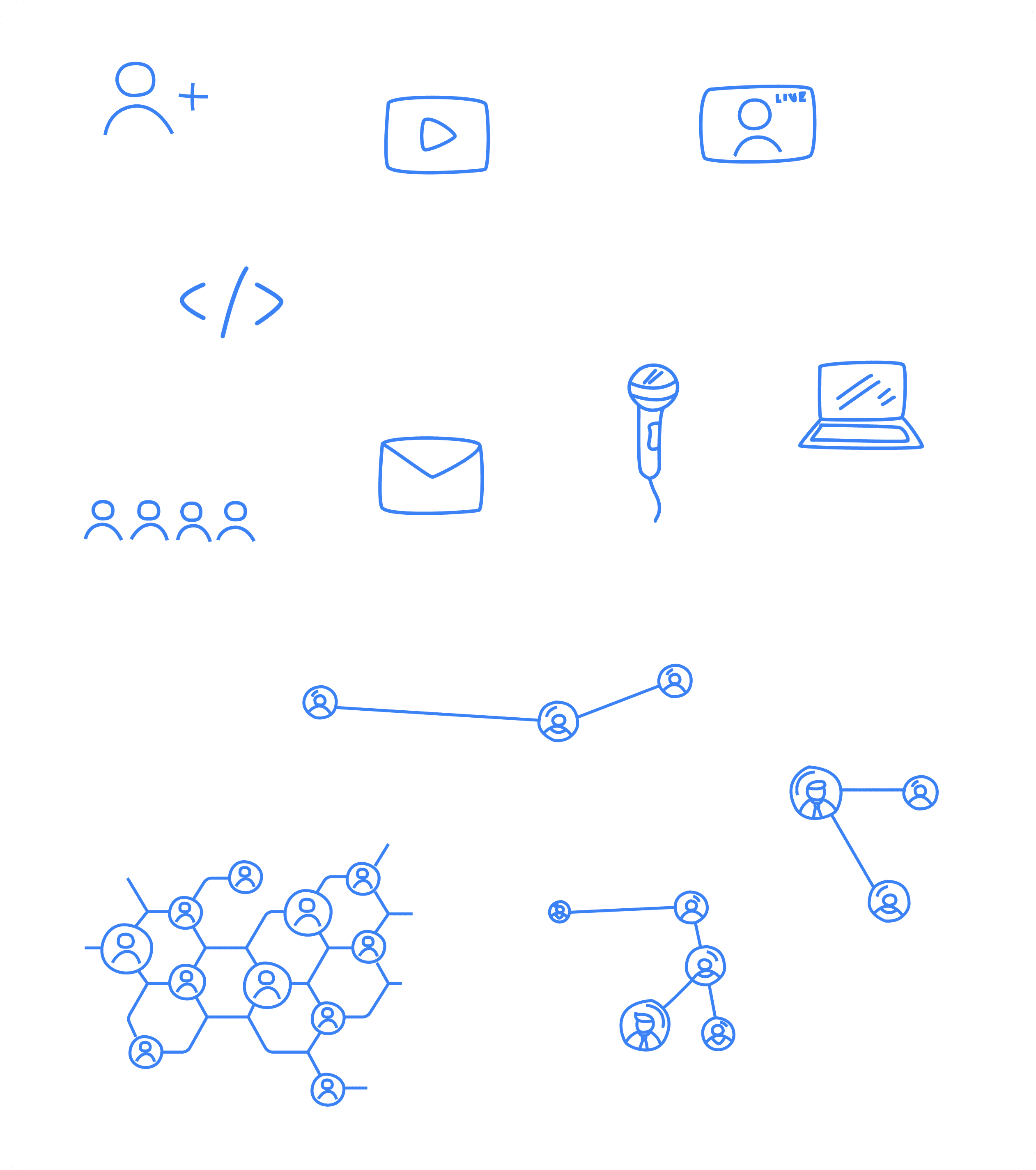
Doodles
I added personal hand-designed doodles to the homepage, giving it a unique touch. ❤️
The 'About Us' page is the first step in building trust
The inclusion of the About page makes visitors feel more connected and informed. It fits with Commudle's mission showing inclusivity and community.
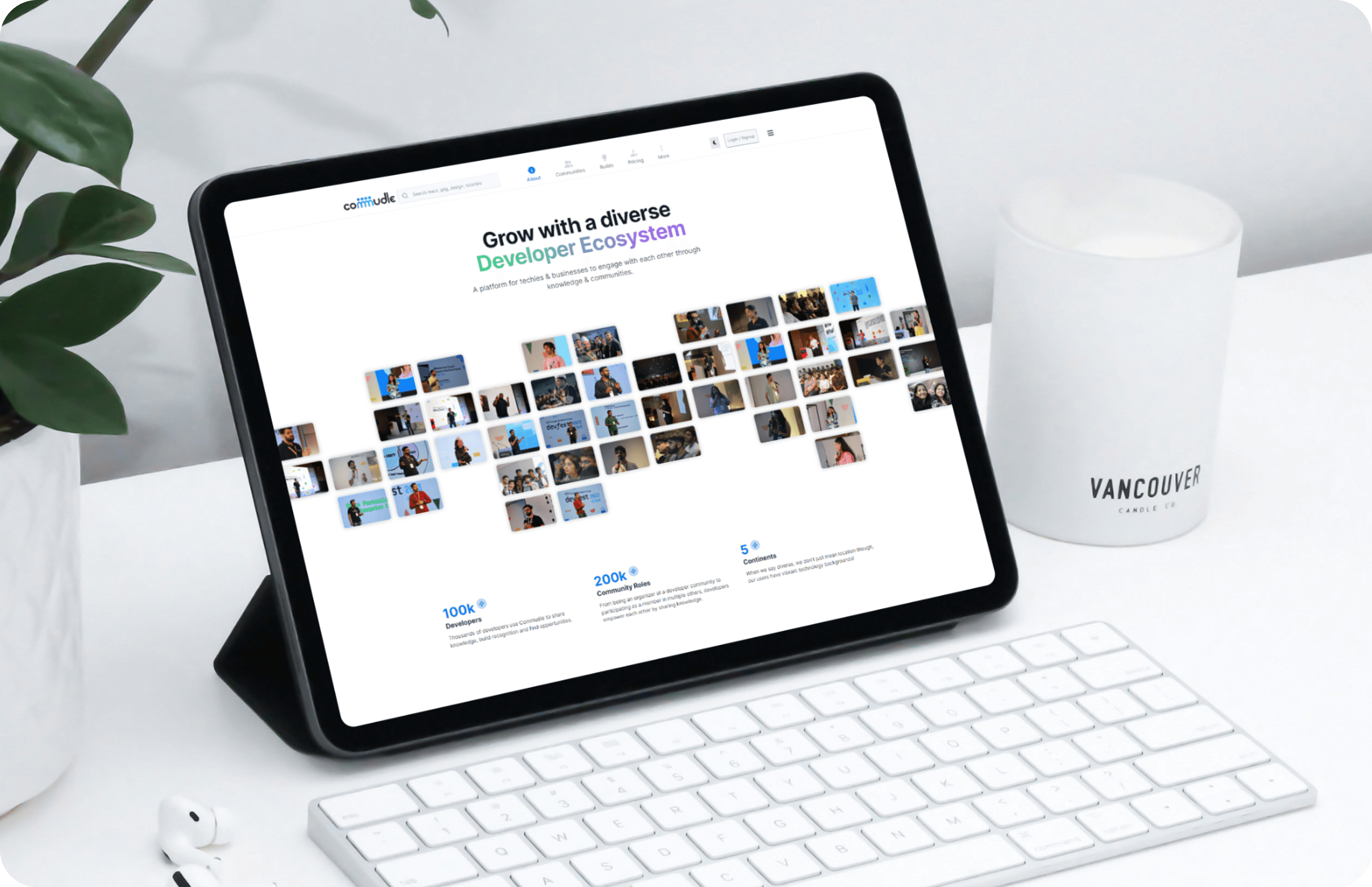
*Mockup showcasing the design of the About Us page
Every design has a reason behind it!
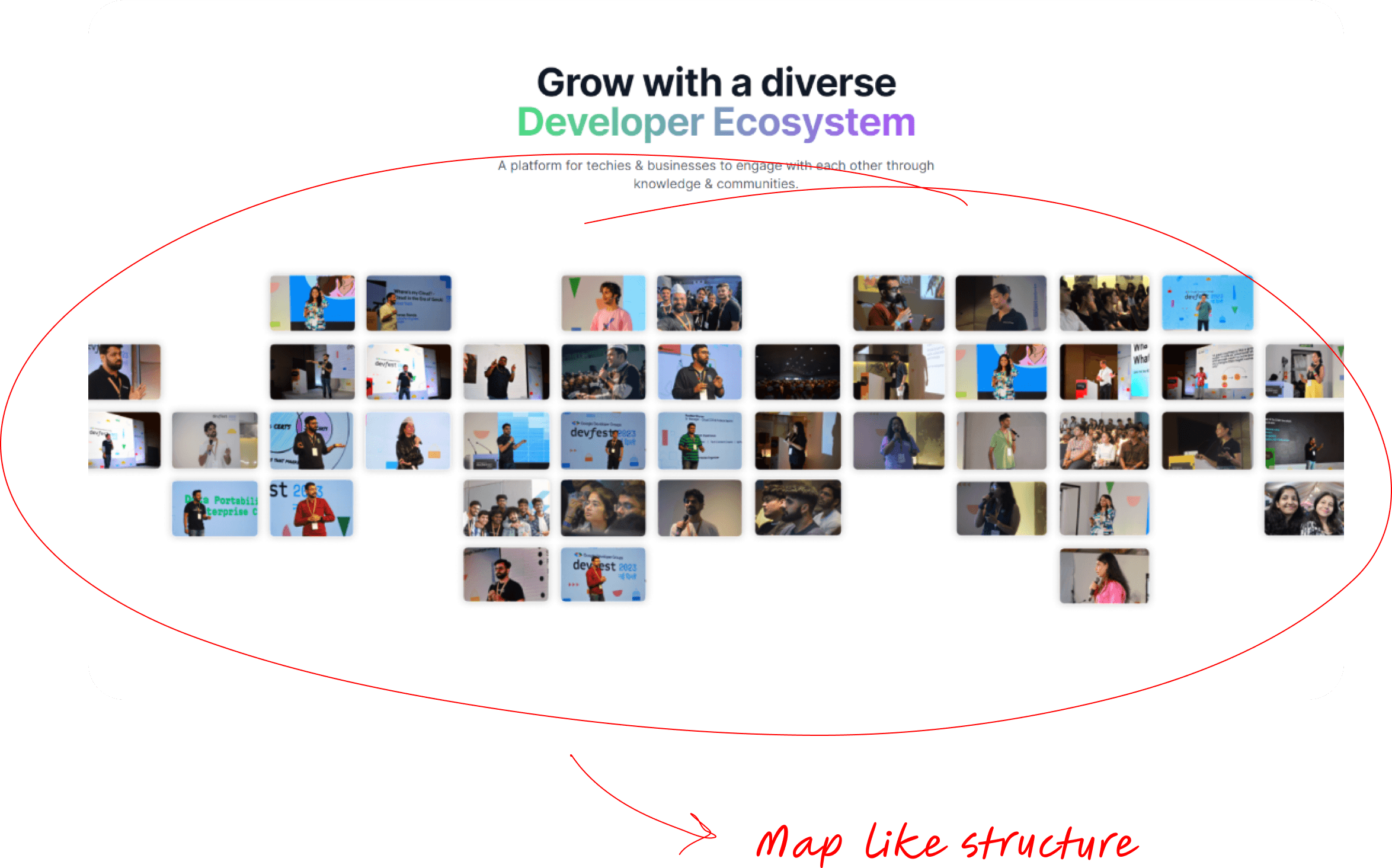
The About page needed a compelling visual element to introduce users to the diverse community that makes up Commudle
I designed a hero image structured like a world map, featuring a collage of photos representing individuals from various communities.
Over 5k visits to the About page—proving first impressions matter.
In just four months, the About page has attracted over 5,000 visits, highlighting its growing importance and engagement with users.
User Profile page —where user experience becomes uniquely theirs.
Commudle's user profile page is now more user-centric with a streamlined layout.
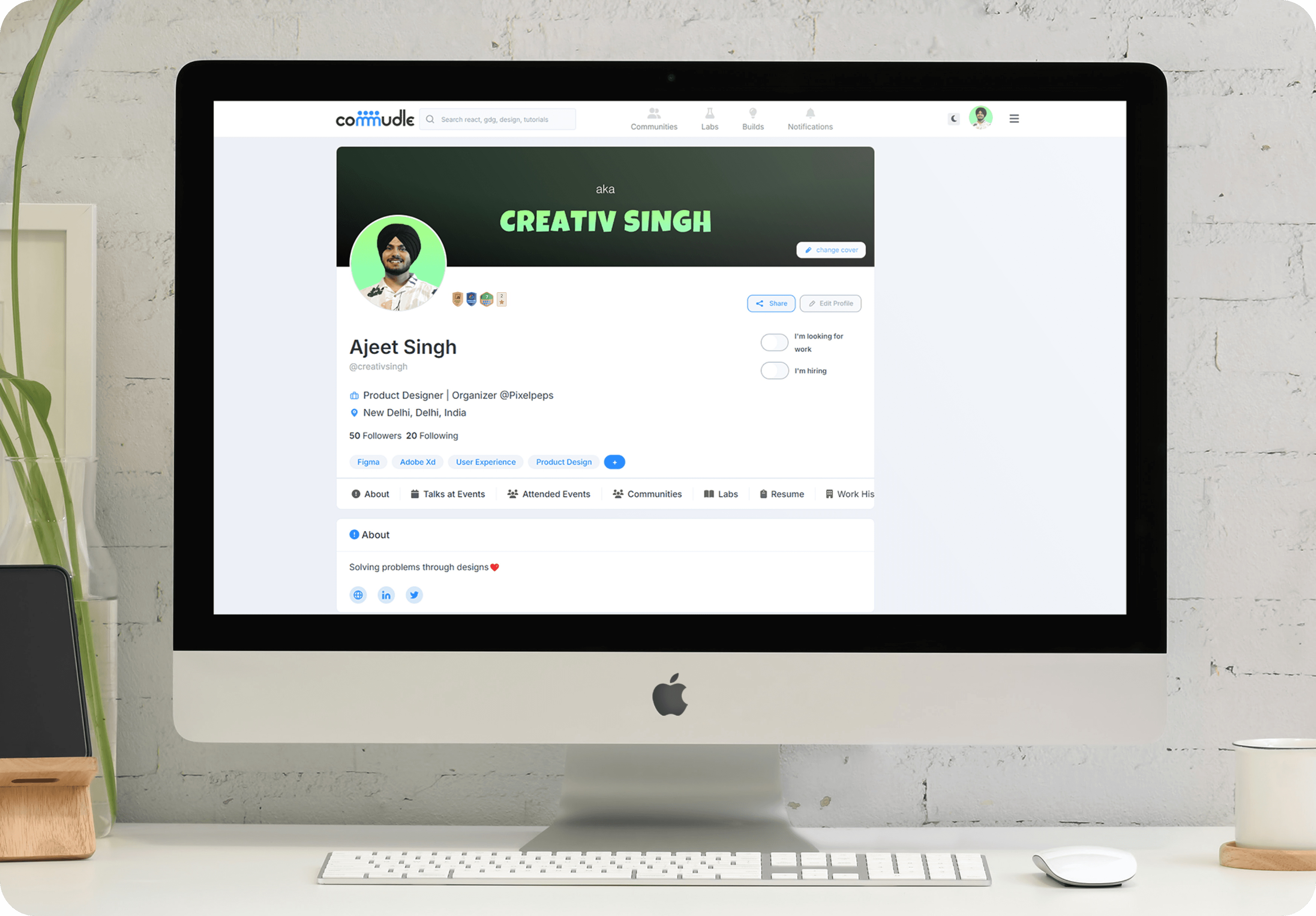
*Mockup of the User Profile page design
Let's dive into the key elements that shaped the User Profile design.
Badges
To highlight users' achievements and contributions, I integrated a badge display feature next to the profile photo. This visually represents the user's involvement within the community and encourages others to engage actively.

Toggle Switch for Freelancers
For users offering services or looking for opportunities as freelancers, I introduced a toggle switch. This switch allows users to easily indicate whether they are available for hire, seeking opportunities, or both. It simplifies the process of connecting freelancers with potential clients or collaborators.

Talks Given and Events Attended
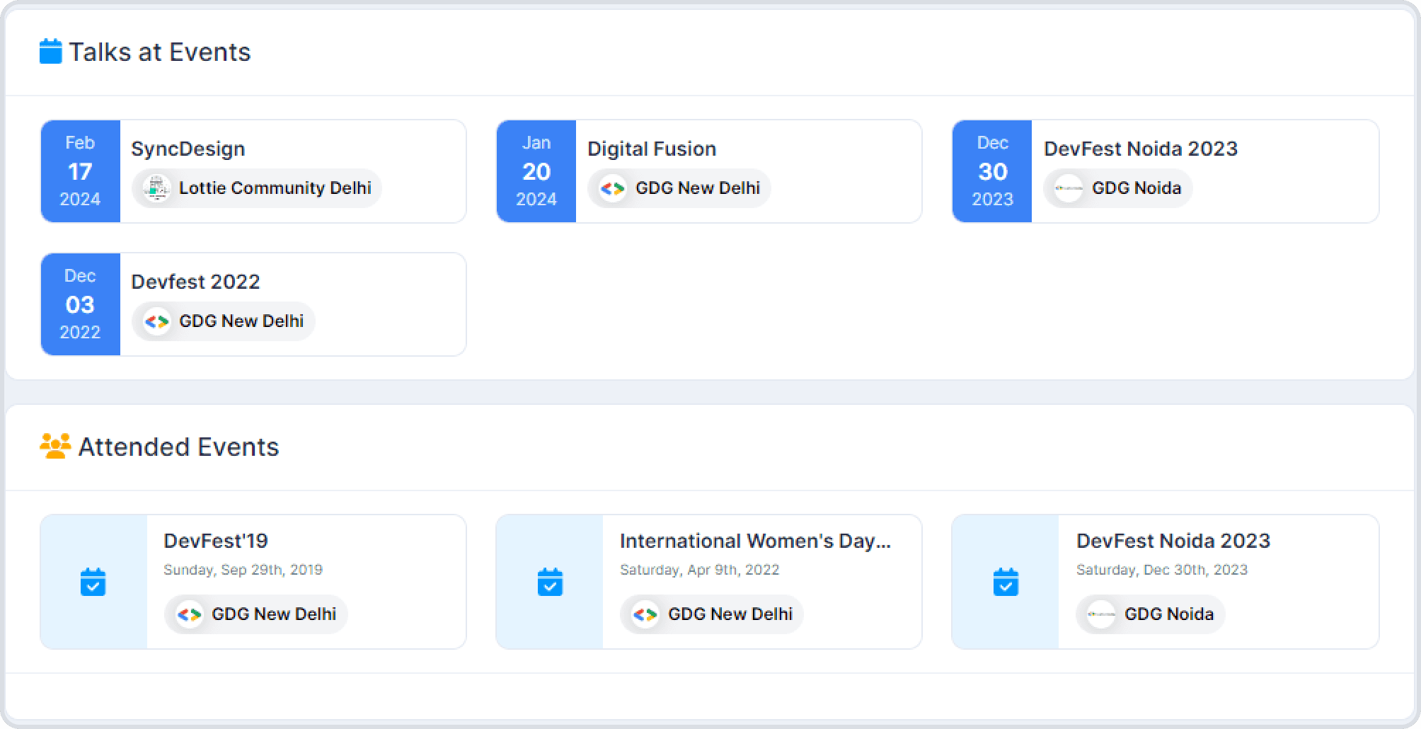
To showcase users' expertise and community involvement, I included sections to display talks given at particular events and events attended. This feature adds credibility to the user's profile and helps other community members identify shared interests.
220k+ engagements on User Profile pages in the last year—showing a clear shift towards deeper user interaction.
Over 10k users actively utilizing the toggle switch.
Approximately 10,000 users, constituting about 12% of the current database, actively utilize the toggle switch feature to indicate their availability for hiring or seeking work.
Profiles went from 0 to 100 real quick with a fourfold increase.
Design is a continuous journey—there's always room for improvement and future considerations.
Continual monitoring of user feedback and industry trends is crucial to remain at the forefront of community building and online networking.
Opportunities for further enhancements, potential collaborations, and new features are worth exploring to strengthen the platform's position as a dynamic and inclusive online community.
Thank you for reading!! ❤️
I invite readers to visit Commudle.com, explore the redesigned features, and provide feedback to help us continually improve the platform. Your engagement and contributions are vital to our shared success.
For inquiries, collaborations, or further information, please reach out to creativsingh@gmail.com.


